BFC
块格式化上下文(Block Formatting Context,BFC)。它是一个独立的渲染区域,只有块级盒子(block-level box)参与, 它规定了内部的块级盒子如何布局,并且与这个独立盒子里的布局不受外部影响,当然它也不会影响到外面的元素。
创建 BFC :
- 根元素(
<html>) - overflow 值不为 visible 的块元素
- 浮动元素(元素的 float 不是 none)
- 绝对定位元素(元素的 position 为 absolute 或 fixed)
- 行内块元素(元素的 display 为 inline-block)
- 表格单元格(元素的 display为 table-cell,HTML表格单元格默认为该值)
- 表格标题(元素的 display 为 table-caption,HTML表格标题默认为该值)
- 匿名表格单元格元素(元素的 display为 table、table-row、 table-row-group、table-header-group、table-footer-group(分别是HTML table、row、tbody、thead、tfoot的默认属性)或 inline-table)
- display 值为 flow-root 的元素
- contain 值为 layout、content或 paint 的元素
- 弹性元素(display为 flex 或 inline-flex元素的直接子元素)
- 网格元素(display为 grid 或 inline-grid 元素的直接子元素)
- 多列容器(元素的 column-count 或 column-width 不为 auto,包括 column-count 为 1)
- column-span 为 all 的元素始终会创建一个新的BFC,即使该元素没有包裹在一个多列容器中(标准变更,Chrome bug)。
BFC 的特性:
1.内部的块级元素会在垂直方向上一个接一个的放置。
2.垂直方向上的距离由margin决定,属于同一个BFC的两个相邻Box的margin会发生叠加
3.bfc的区域不会与float的元素区域重叠,正常情况下,没有设置 bfc 的元素会与 float 元素重叠。(详见 bfc 不与 float 重叠)
4.计算bfc的高度时,浮动元素也参与计算。(清除浮动、haslayout)
5.bfc就是页面上的一个独立容器,容器里面的子元素不会影响外面元素。
例子:
-
BFC中的盒子对齐
内部的块级元素会在垂直方向上一个接一个的放置。
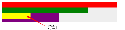
浮动的元素也是这样,box3浮动,他依然接着上一个盒子垂直排列。并且所有的盒子都左对齐。
1 | <div class="container"> |
- 外边距折叠
特性的第二条:垂直方向上的距离由margin决定在常规文档流中,两个兄弟盒子之间的垂直距离是由他们的外边距所决定的,但不是他们的两个外边距之和,而是以较大的为准。
补充
- 就算父元素不是 BFC 模式,兄弟的块级元素(block)的垂直外边距(margin-top、margin-bottom)也会发生折叠
- 内联块级元素(inline-block)任何情况下的垂直或者水平外边距都不会发生折叠
- 内联元素(inline)任何情况下的垂直内外边距(padding/margin-top、padding/margin-bottom)都是失效的,并且width,height也是失效的,水平外边距不会发生折叠
关于 block、inline、inline-block的区别,详见行内元素和块级元素的具体区别是什么?inline-block是什么?
1 | <div class="container"> |
这里我门可以看到,第一个子盒子有上边距(不会发生margin穿透的问题);两个子盒子的垂直距离为20px而不是30px,因为垂直外边距会折叠,间距以较大的为准。
那么有没有方法让垂直外边距不折叠呢?答案是:有。特性的第5条就说了:bfc就是页面上的一个独立容器,容器里面的子元素不会影响外面元素,同样外面的元素不会影响到BFC内的元素。所以就让box1或box2再处于另一个BFC中就行了。
1 | <div class="container"> |
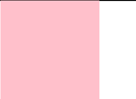
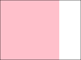
- 不被浮动元素覆盖
以常见的两栏布局为例。
左边固定宽度,右边不设宽,因此右边的宽度自适应,随浏览器窗口大小的变化而变化。

1 | <div class="column"></div> |
还有三栏布局。
左右两边固定宽度,中间不设宽,因此中间的宽度自适应,随浏览器的大小变化而变化。

1 | <div class="contain"> |
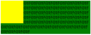
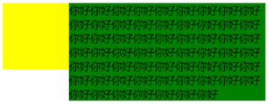
也可以用来防止字体环绕:
众所周知,浮动的盒子会遮盖下面的盒子,但是下面盒子里的文字是不会被遮盖的,文字反而还会环绕浮动的盒子。这也是一个比较有趣的特性。
html:
1 | <div class="left"></div> |
css:
(1)环绕
1 | .left { |
(2)利用bfc防止环绕
1 | .left { |
- BFC包含浮动的块
这个是大家再熟悉不过的了,利用overflow:hidden清除浮动嘛,因为浮动的盒子无法撑出处于标准文档流的父盒子的height。
1 | <head> |
给浮动属性元素的父级元素开启 BFC。(overflow:hidden,绝对定位,浮动)
参考